What are these anamorphic cartograms and why do we use them?
Simple Short answer:
Usually maps are based on geometric entities, like districts or countries. The mapped area of each unit corresponds to its real world area. Sometimes it’s helpful to crack up this real-world/mapped area relationship and replace the area with other variables. Each basic unit would be distorted in a way that the newly created unit has a size which correlates with the variable value without breaking the topology (neighborhoods).
If you want to know more, have a look at Wikipedia and at projects like Worldmapper or Views Of The World, or simply continue reading here.
Detailed explanation:
Let’s assume that you have found an interesting fact (let’s say the distribution of a country’s population) and you want to draw a map to illustrate it. You probably want to start with some geometries which correspond to your data units, something like administrative districts. What you get is an almost empty map with some districts that are surrounded by single lines which delimit the area of the districts.

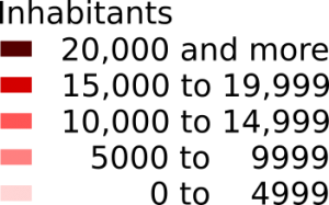
Most people like colors. Why not use them to make your map nicer and more meaningful? In order to do so, you have to make a decision which colors to use and how to connect them to your data. So you might split your numbers into different groups (or classes) and assign a distinctive color to each one. Yay! We have a legend.
So let’s do some painting

As this is your first map, you are anxious to avoid any mistakes. Therefore you ask a friend of yours, a recognized cartographer, to take a look at your map. The cartographer puts on a wise face and says: “Hmm…You may not use absolute numbers as a basis for coloring areas. That’s a no-go! You better use some relative measure like the population density.”
You follow the cartographer’s council and after some calculations and number crunching you finally have your new legend and map, which shows the number of inhabitants per area.
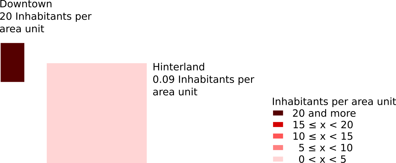
Strangely enough, the map looks exactly the same as your first attempt. Can it be, that this well known expert gave wrong advice to you? No. The point is, if you are using areas of different sizes (like administrative units tend to be) you have to take this differences into account. One way to achieve this, is to adapt your variable to the size of the underlying geographic unit. It may not be visible with just two units but have look at the following maps.
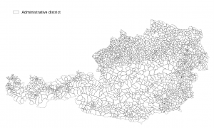
The basic map shows administrative districts (municipalities) of Austria.
The two maps coming next illustrate the population of each district. Both of them use a special type of classification, to make sure each class has the same count of members. This method is not the best to show where Austria is settled densely or sparsely, but illustrates the point of absolute vs. relative numbers /measures more clearly.
The first one features the plain absolute numbers of inhabitants. The second one the population density expressed by inhabitants per km².
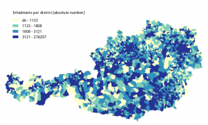
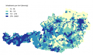
Both maps are far from perfect. Nevertheless, the second map offers an impression of Austria’s densely and sparsely settled parts, which is way better than in the first map. Especially in the north-eastern regions around Vienna.
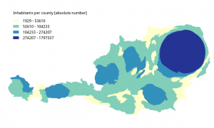
But as we are still dealing with areas of administrative units it’s easy to overlook the fact that roughly a fifth of Austria’s citizens live in Vienna. This is where anamorphic cartograms come into play. Let’s get rid of these areas. We don’t want to provide maps for navigation, we want to illustrate some social issues. We are interested in people, not in km².
So districts with more people living in it should become larger (grow) and lesser populated districts should shrink. But how can we change the size of our units? Scaling a single unit to make its area bigger or smaller is easy. But we will face a whole lot of problems when dealing with a group of units, like how to preserve the neighborhood relationships (topology) or the general outline for example? This has been a long going research question in the field of cartography and a bunch of clever people came up with different solutions. We rely on the QGis-Plugin Cartogram (plus our own tweaks to it), which in turn is based on the following paper: Dougenik, J. A, N. R. Chrisman, and D. R. Niemeyer. 1985. “An algorithm to construct continuous cartograms.” Professional Geographer 37:75-81
Applying this approach to our problem of Austria’s population you get a distorted map which clearly shows a different image (this time based on counties rather than municipalities).
Data-sources:
https://www.data.gv.at/
http://statcube.at/statcube/home